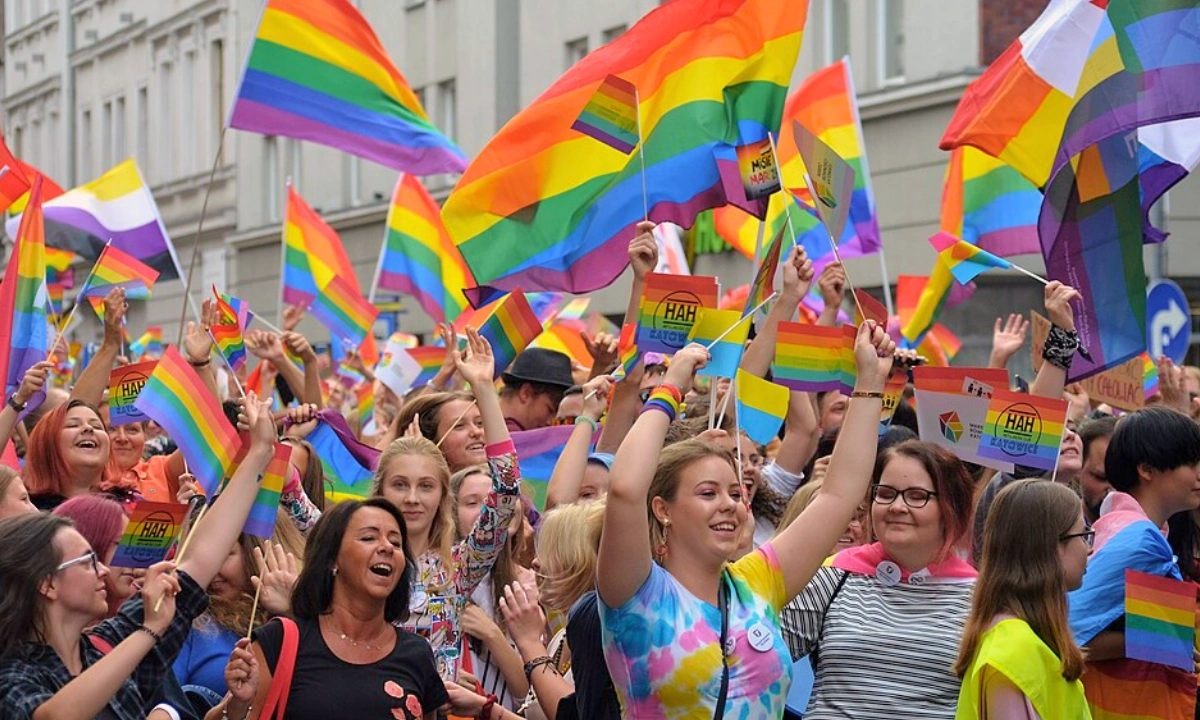

Pride flags are community symbols used to express identity, visibility, solidarity, and belonging. The six-colour rainbow is the most familiar, but many communities also use flags connected to a particular sexual or romantic orientation, gender identity, or set of sex characteristics.
This guide covers major and widely recognised designs. It explains what they represent, who created them, and how their colours are commonly understood. Some flags also have important variations, which are noted throughout where useful. More detailed histories and variant guides are available in the linked articles.
? Note:
There is no single official list of Pride flags. Some designs have clearer origins or wider adoption than others. Where the history is uncertain, or several versions exist, that is noted rather than presented as settled fact.
Pride Flags and What They Mean
Pride flags can represent an entire community or a particular identity within it. Some were created by individuals, while others emerged through community voting or online projects.
The meaning of a flag can also come from different sources. Sometimes it reflects the designer’s original explanation. In other cases, communities have since given the colours additional meanings.
The flags below are a curated selection of historically significant umbrella designs and widely recognised identity flags. It is not an official or complete list.
Rainbow, Progress and Inclusive Pride Flags
The rainbow flag has changed several times since its first appearance in 1978. Later designs did not replace the earlier versions. Instead, they adapted the symbol to make different communities or concerns more visible.
That development can be seen in the original eight-stripe flag, the six-stripe rainbow, the Philadelphia Pride Flag, the Progress Pride Flag, and the Intersex-Inclusive Progress Pride Flag.
Original Eight-Stripe Rainbow Flag
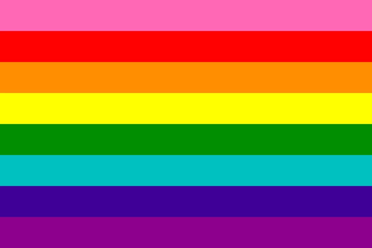
Gilbert Baker’s original Rainbow Flag debuted at San Francisco’s Gay Freedom Day celebration on June 25, 1978. Baker worked with Lynn Segerblom, James McNamara and other volunteers to produce the first flags.
The eight stripes each had a specific meaning:
| Colour | 意味 |
|---|---|
| Hot pink | Sex |
| 赤 | ライフ |
| オレンジ | Healing |
| イエロー | Sunlight |
| Green | Nature |
| Turquoise | Art or magic |
| Indigo | Harmony or serenity |
| Violet | Spirit |
Baker intended the rainbow to be a positive symbol of visibility and liberation.
Six-Stripe Rainbow Flag
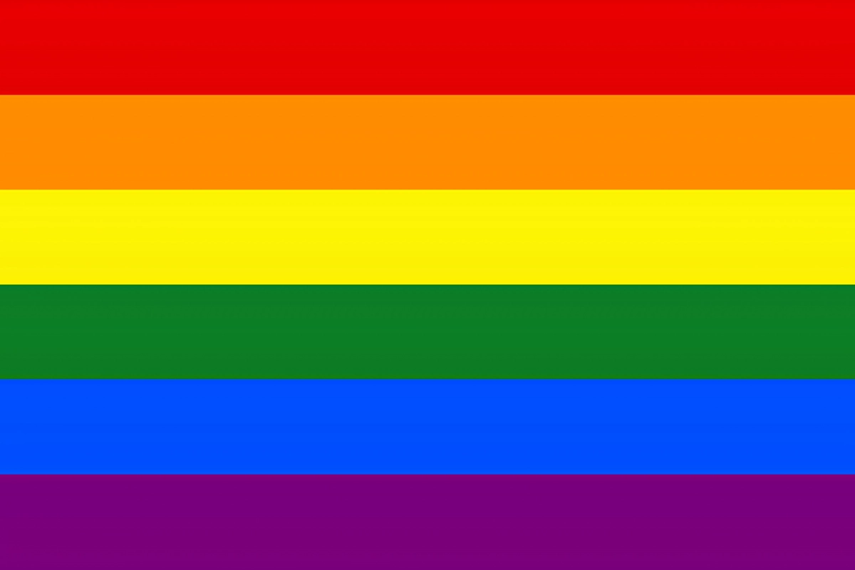
The rainbow flag most people recognise today is a simplified version of Baker’s original design. Hot pink was removed because the fabric was difficult to source. Turquoise was later dropped so the remaining stripes could be divided evenly around San Francisco street lamps.
The modern flag has six stripes:
- 赤
- オレンジ
- イエロー
- Green
- ブルー
- Violet
It became the most widely recognised symbol of LGBTQ+ Pride and solidarity. It represents the broader LGBTQ+ community rather than one particular identity.
Philadelphia Pride Flag
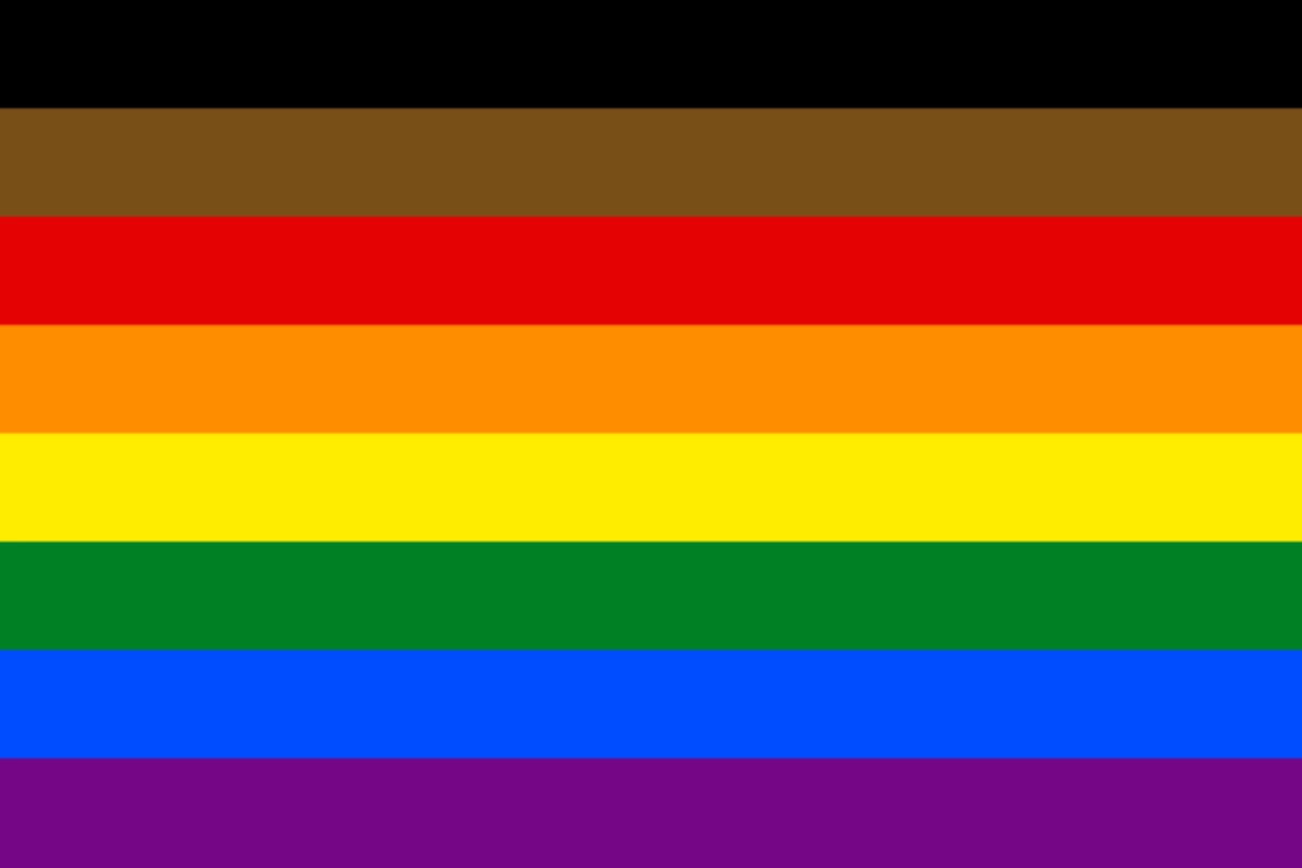
By 2017, the rainbow flag was being adapted again to make particular communities more visible. Philadelphia’s Office of LGBT Affairs launched the ‘More Color, More Pride’ campaign, adding black and brown stripes to the six-colour design.
The additional stripes were intended to highlight racial diversity, equality, and inclusion within LGBTQ+ communities.
The design also became an important step in the development of the Progress Pride Flag.
プログレス・プライド・フラッグ
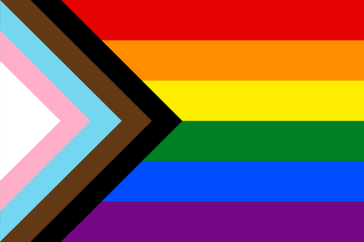
ダニエル・クエーサー took the idea of highlighting marginalised communities further in 2018. The Progress Pride Flag places a chevron at the starting point of the rainbow design.
The chevron combines transgender colours with the black and brown stripes associated with marginalised LGBTQ+ communities and the Philadelphia Pride Flag. It points forward to represent progress, while its position at the start emphasises that progress is still needed.
Quasar also used the black stripe to remember people living with or lost to HIV/AIDS.
インターセックス・インクルーシブ・プログレス・プライド・フラッグ
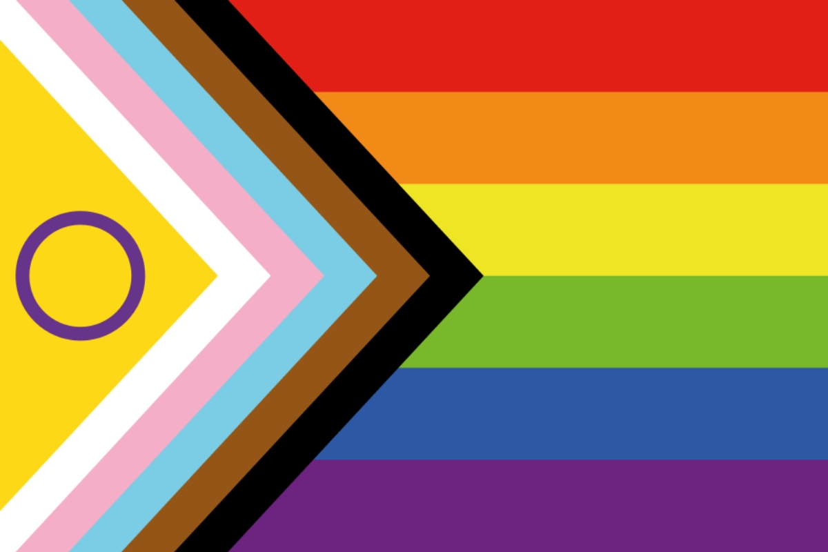
The Intersex-Inclusive Progress Pride Flag adds another community to the Progress design. ヴァレンティーノ・ヴェッキエッティ created it in 2021.
The design incorporates the yellow field and purple circle from Morgan Carpenter’s 2013 Intersex Flag into the Progress Pride chevron. The circle represents wholeness and completeness.
The addition makes intersex inclusion and diverse sex characteristics explicit within the wider Progress Pride design.
For more detail on this flag, see our intersex-inclusive Progress Pride Flag guide.
Sexual and Romantic Orientation Flags
Pride flags can also represent particular sexual or romantic orientations. The designs below have different histories: some were created by individuals, while others came from online community projects.
Their colour meanings usually reflect the explanations given by their creators, although communities may understand or use them in broader ways today.
Gay Men’s Pride Flag
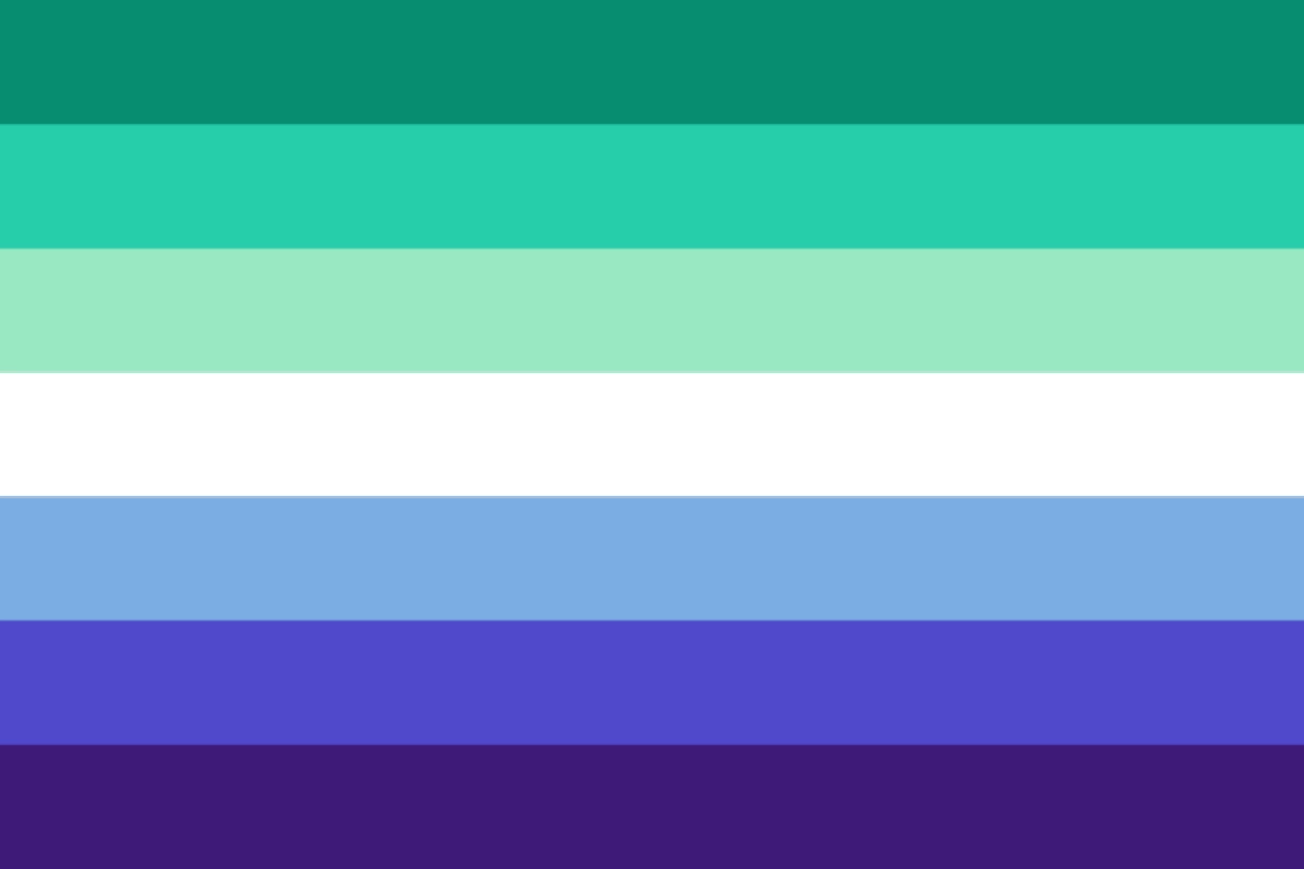
The commonly used Gay Men’s Pride Flag appeared on Tumblr in 2019. It was posted by the user gayflagblog and is available in both seven-stripe and five-stripe versions.
| 色 | 意味 |
|---|---|
| Greens | Community, healing and joy |
| 白 | Trans, nonbinary and gender-nonconforming men |
| Blue and purple | Love, strength and diversity |
The flag is specific to gay men, rather than a replacement for the broader rainbow flag.
Lesbian Pride Flag
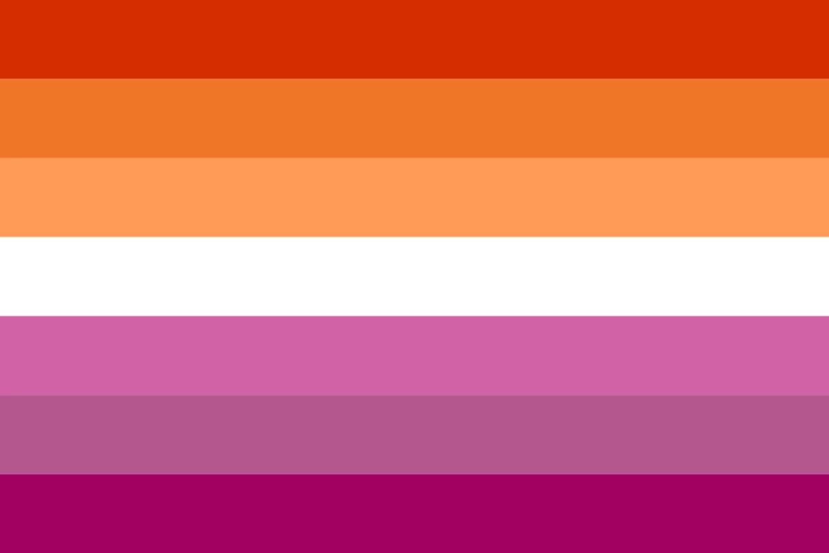
The orange-and-pink Lesbian Pride Flag was created by Emily Gwen in 2018. The original design had seven stripes, each with a stated meaning.
From top to bottom, they represented:
| Colour | 意味 |
|---|---|
| Dark orange | Gender nonconformity |
| オレンジ | 独立 |
| Light orange | コミュニティ |
| 白 | Unique relationships to womanhood |
| Light pink | Serenity and peace |
| Dusty/ medium pink | Love and sex |
| Dark rose/ pink | 女性らしさ |
A five-stripe version later became common. It removes the second and sixth stripes from the original design. Lesbian communities have also used several other flags, but the orange-and-pink design is now one of the most widely recognised.
For more detail on this flag, see our lesbian flag variations guide.
バイセクシャル・プライド・フラッグ
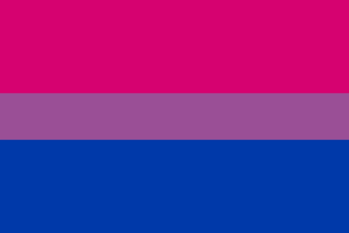
Michael Page created the Bisexual Pride Flag in 1998. It debuted at the first anniversary event for BiCafe on 5 December that year.
Bisexuality is commonly understood today as attraction to more than one gender. Page’s original explanation of the flag, however, used different language:
| Colour | 意味 |
|---|---|
| ピンク | Same-sex attraction |
| ブルー | Opposite-sex attraction |
| 紫 | The overlap between them |
These meanings reflect Page’s original explanation of the design. They should not be treated as a modern definition of which genders bisexual people can be attracted to.
For more detail, see the bisexual flag meaning and history guide on our website.
パンセクシュアル・プライド・フラッグ
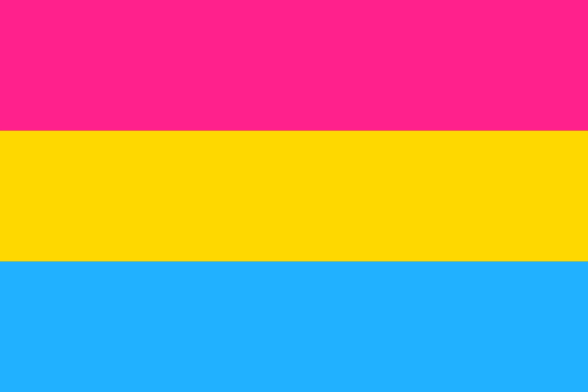
Pansexuality is commonly described as attraction in which gender is not a determining factor. Some people describe it as attraction to people of any gender.
The familiar magenta, yellow and cyan flag dates to 2010. It is attributed to Tumblr user ジャスパーV, reflecting the flag’s online origins.
| Colour | 意味 |
|---|---|
| Magenta | Attraction to women |
| Cyan | Attraction to men |
| イエロー | Attraction to people outside the gender binary |
Pansexuality should not be described as a more inclusive version of bisexuality. The two identities have different histories and are described differently by the people who use them.
For more detail, see our pansexual flag meaning and history guide.
アセクシャル・プライド・フラッグ
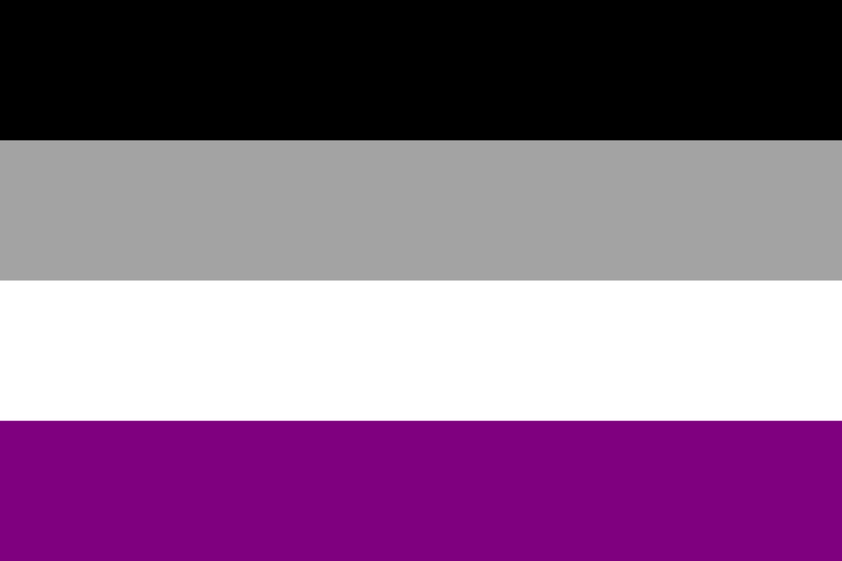
Asexuality generally refers to experiencing little or no sexual attraction. It is a spectrum of experiences and is not the same as celibacy.
The current アセクシャル・プライド・フラッグ emerged from a community design and selection process organised through AVEN in 2010. The winning design was submitted by a user known as standup.
Its four colours have established meanings:
| Colour | 意味 |
|---|---|
| 黒 | Asexuality |
| Grey | Grey-asexuality and demisexuality |
| 白 | Sexuality |
| 紫 | コミュニティ |
For more detail, see our asexual flag meaning and history guide on the Japan Gay Guide website.
アロマンティック・プライド・フラッグ

Aromanticism generally refers to experiencing little or no romantic attraction. People on the aromantic spectrum can have different experiences of attraction and relationships.
The widely used five-stripe Aromantic Pride Flag was redesigned by Tumblr user Cameron, also known as cameronwhimsy, in 2014.
| Colour | 意味 |
|---|---|
| Dark green | Lack of romance |
| Light green | Aromantic spectrum |
| 白 | Platonic, aesthetic and queerplatonic relationships |
| Grey | Demiromantic people |
| 黒 | Sexuality spectrum |
アロエース・プライドフラッグ
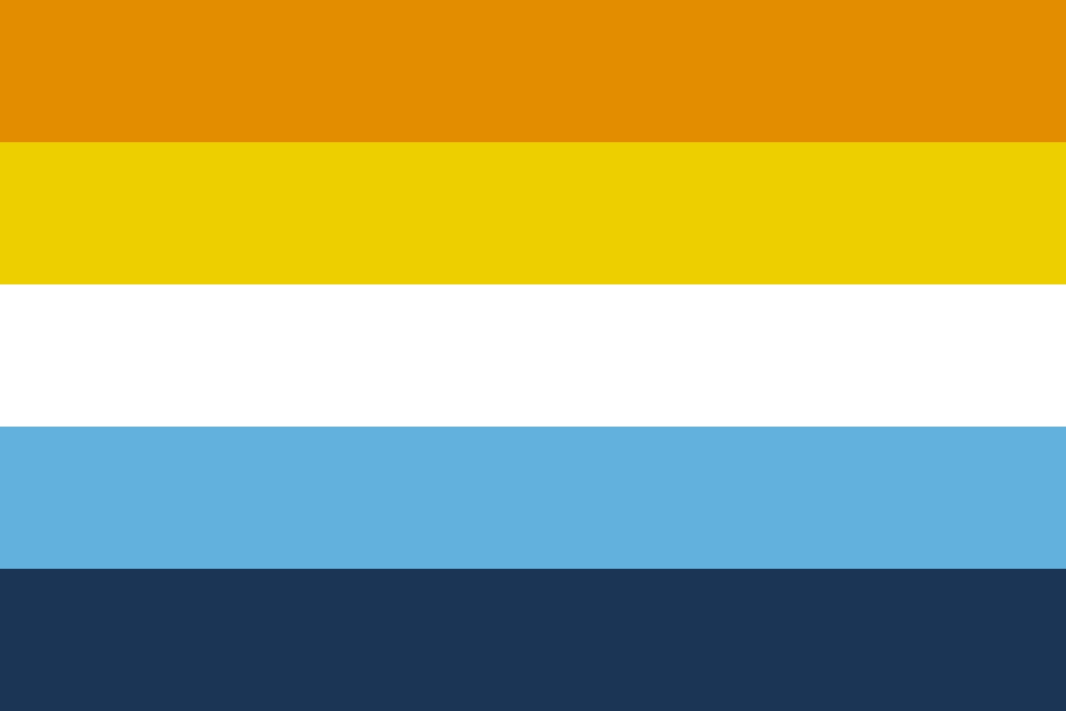
Aroace is a term used by people who identify on both the aromantic and asexual spectra. It generally describes people who experience little or no romantic and sexual attraction.
The sunset Aroace Flag was created by Tumblr user aroaesflags in 2018. From top to bottom, the stripes mean:
| Colour | 意味 |
|---|---|
| オレンジ | コミュニティ |
| イエロー | Love and relationships outside conventional romantic and sexual expectations |
| 白 | Wholeness |
| Light blue and dark blue | Aroace identity and range of aroace experiences |
For more detail, see our aroace flag colours and variations guide.
ジェンダー・アイデンティティ・フラッグ
Gender identity flags represent different experiences of gender. Some identities overlap, but they are not interchangeable.
The designs below include several widely recognised gender identities, each with its own history and symbolism.
トランスジェンダー・プライド・フラッグ
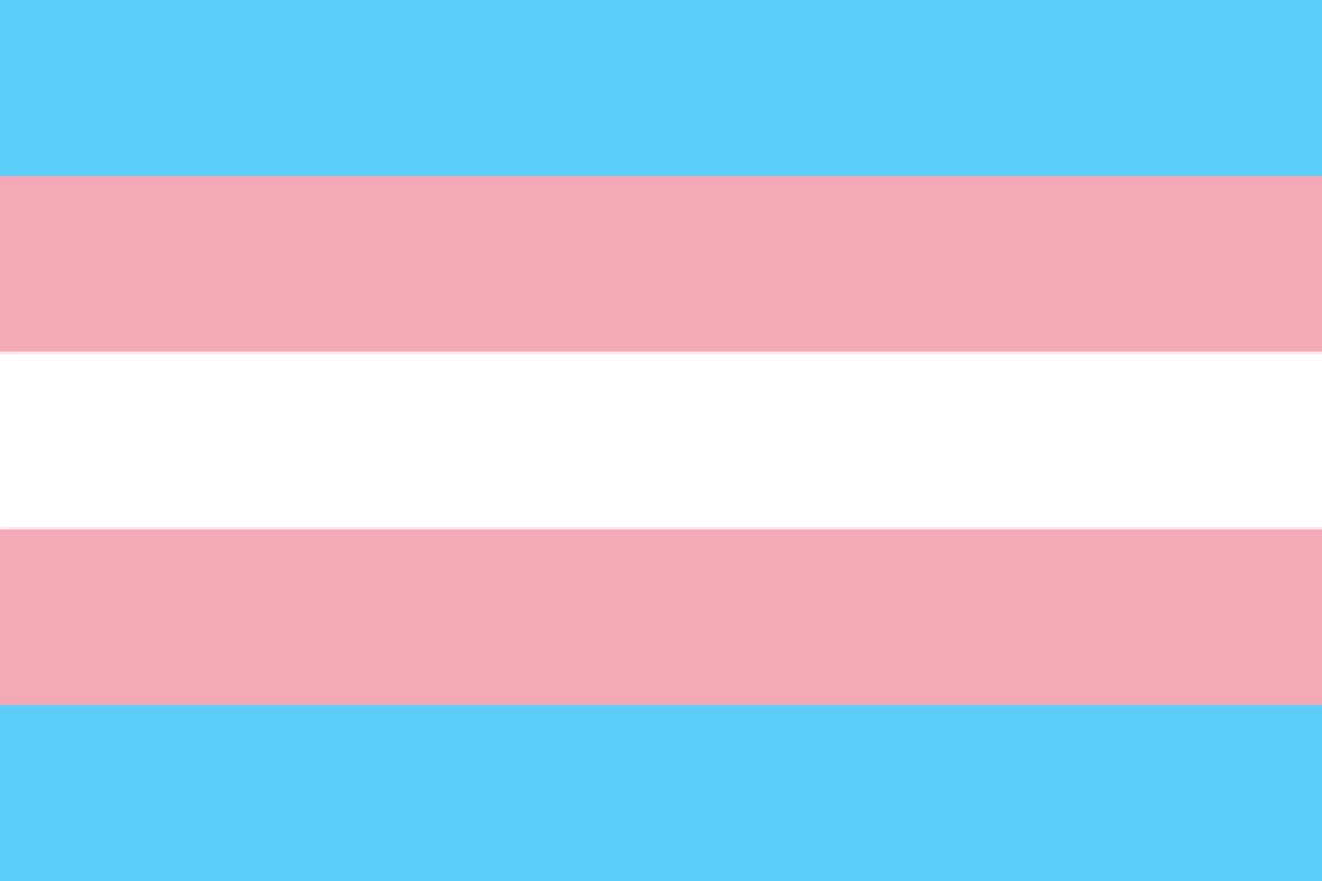
Transgender people have a gender that differs from the sex they were assigned at birth, although people may describe their experiences in different ways. The Transgender Pride Flag was designed by trans activist Monica Helms in 1999. She first displayed it publicly at a Phoenix Pride parade in 2000.
| Colour | 意味 |
|---|---|
| Pale blue | Colour traditionally associated with boys |
| Pale pink | Colour traditionally associated with girls |
| 白 | People who are intersex, transitioning, or outside or without a defined gender |
Helms also emphasised the flag’s symmetry. Its stripe pattern remains correct whichever way the flag is flown.
For more detail, read our transgender flag meaning and history guide.
Nonbinary Pride Flag
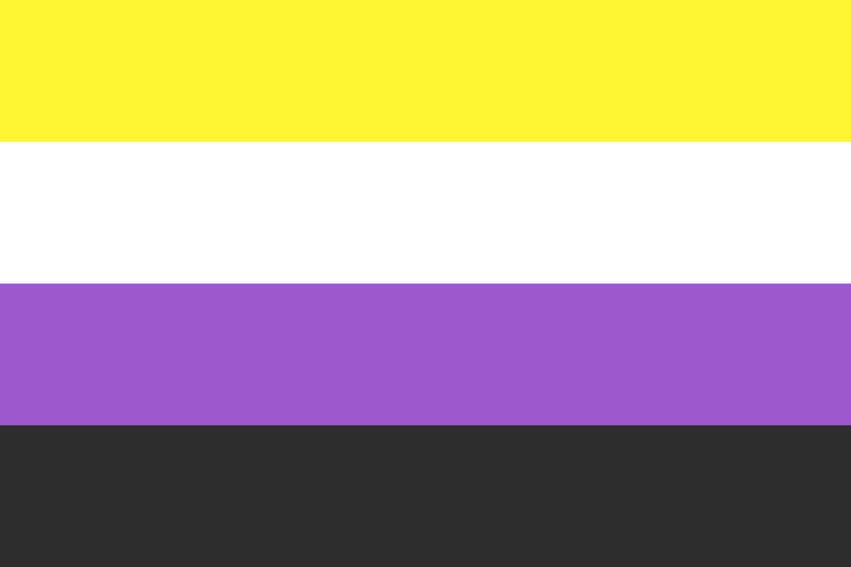
Nonbinary is an umbrella term and identity used for genders that are not exclusively man or woman.
Kye Rowan created the Nonbinary Pride Flag in 2014.
| Colour | 意味 |
|---|---|
| イエロー | Gender outside the binary |
| 白 | People with many or all genders |
| 紫 | Genders that blend or sit between concepts of woman and man |
| 黒 | People without gender |
Rowan intended the design to exist alongside the Genderqueer Pride Flag, rather than replace it.
For more information about the nonbinary flag, see our nonbinary flag meaning and history guide.
Genderqueer Pride Flag
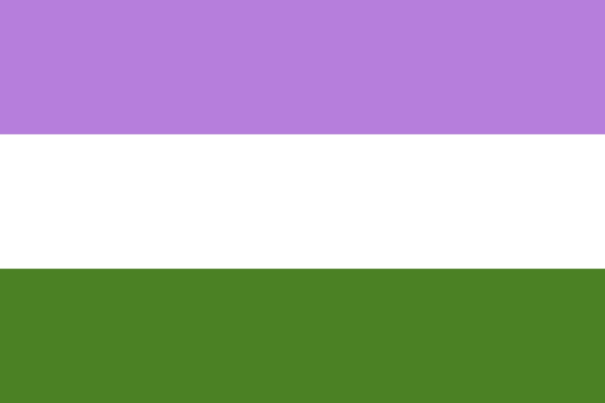
The Genderqueer Pride Flag predates the Nonbinary Pride Flag. Marilyn Roxie created its three-stripe design in 2011.
Genderqueer is an identity or umbrella term used by some people whose gender is outside, between or challenges conventional categories.
Roxie’s colour meanings are straightforward:
| Colour | 意味 |
|---|---|
| Lavender | Androgyny and queer identity |
| 白 | Agender and neutral identities |
| Chartreuse green | Identities outside the binary |
Genderfluid Pride Flag
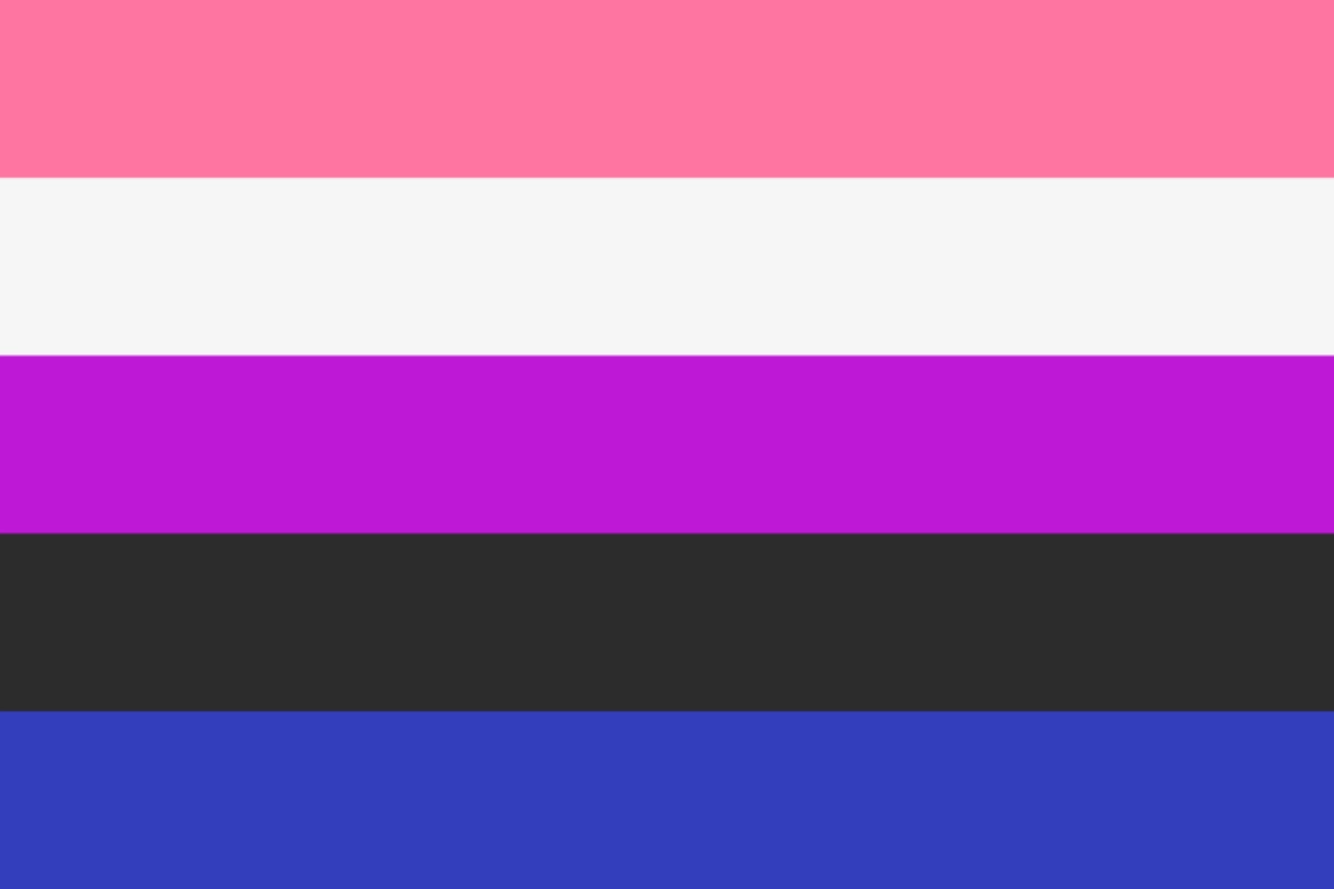
Genderfluid describes an experience in which a person’s gender changes over time. There is no required pattern, schedule or set of genders involved.
JJ Poole created the commonly used five-stripe Genderfluid Pride Flag in 2012.
| Colour | 意味 |
|---|---|
| ピンク | 女性らしさ |
| 白 | Lack of gender |
| 紫 | Androgyny or a combination of masculinity and femininity |
| 黒 | Genders outside the binary |
| ブルー | Masculinity |
アジェンダー・プライド・フラッグ
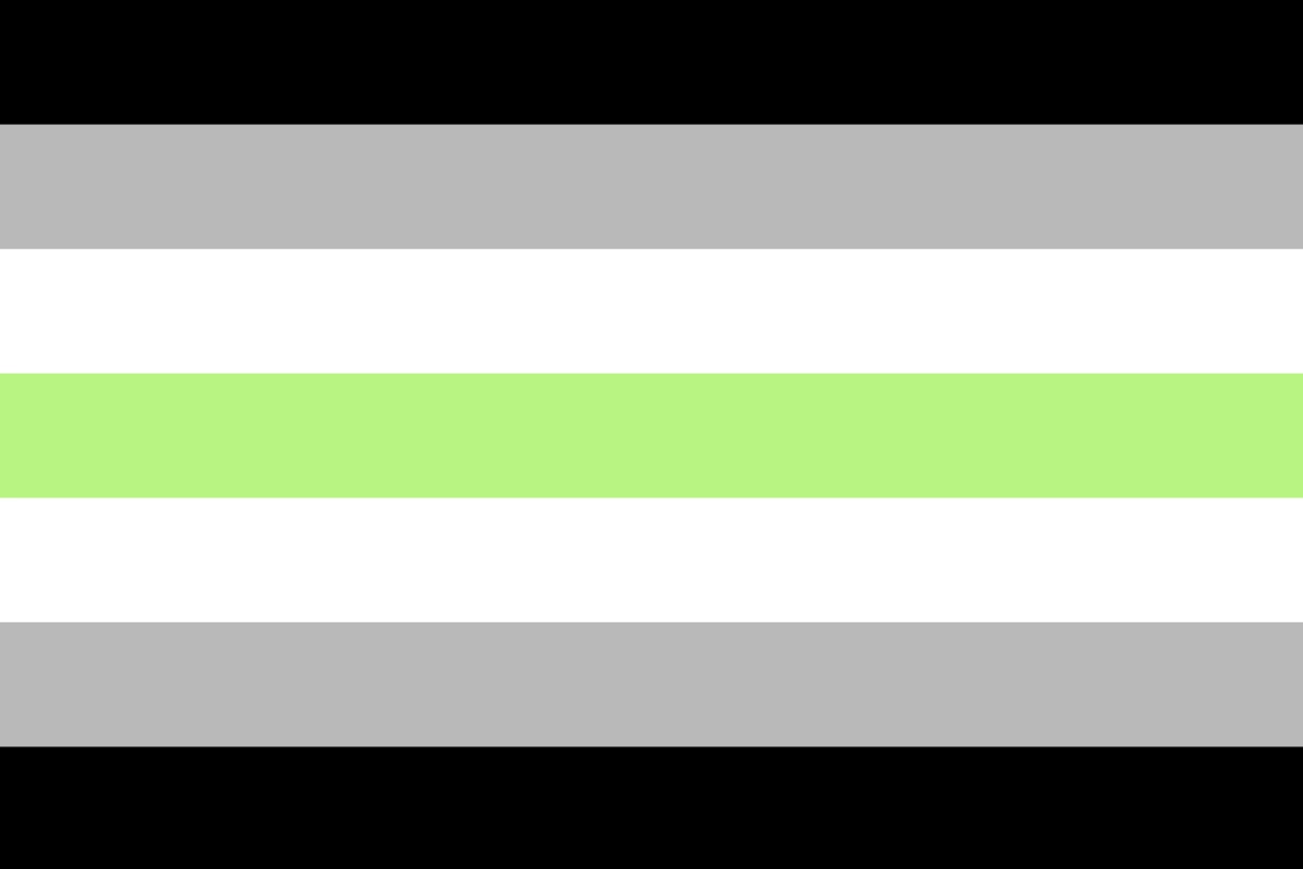
Agender generally describes having no gender, a lack of gender or a genderless identity.
Salem X created the Agender Pride Flag in 2014.
| Colour | 意味 |
|---|---|
| Black and white | Absence of gender |
| Grey | Partial or semi-genderlessness |
| Green | Identities outside the binary |
Intersex Flag
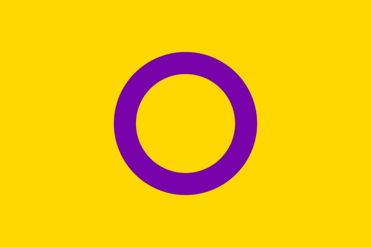
Intersex is about sex characteristics rather than sexual orientation or gender identity. Intersex people are born with physical sex characteristics that do not fit typical medical or social expectations for female or male bodies.
Morgan Carpenter of Intersex Human Rights Australia created the Intersex Flag in 2013.
Its yellow and purple colours deliberately avoid the pink-and-blue coding often associated with gender. The unbroken purple circle represents wholeness, completeness and potential.
Carpenter has also connected the flag with bodily autonomy and the right of intersex people to make decisions about their own bodies.
Using Pride Flags Respectfully
There is no requirement to use a Pride flag or identify with a particular label. People may choose a flag that reflects their identity, while others may prefer the broader rainbow or Progress Pride designs.
Allies can also use these broader flags to show support. A straight-ally flag does exist as an informal symbol, but it is not a core LGBTQ+ identity flag.
Pride flags are community symbols, not rules. People within the same community may use different designs or relate to their flag in different ways.
For more detail about different LGBTQ+ flags, their meanings and their origins, explore our guides to LGBTQ+ flags on the Japan Gay Guide website.